Home → Engineering
Logs and Metrics in Microservices: One Screen, Not Six Log Files
Monday 09:12, an alert: "CPU 68%." Nobody looked; it fired every Monday.
09:40, support: "The payment page is spinning." Six services in the chain, six log
streams, six browser tabs. What found the problem was grep, at 12:10 — three
hours after it started. The cause
was latency in the payment service, and it had been sitting on a graph since 09:05
— on a dashboard nobody looked at.
- The problem was not missing tools. We had metrics and we had logs; in different places, on different time axes, in different tabs.
- Metrics go to Prometheus, logs to Loki, both meet in Grafana. Separate paths, one screen, one second. The value is in the shared time axis, not the tools.
- Metrics say "how much", logs say "what happened". See the spike in the metric, drop into the log of that second. The other way round does not work.
- Labels are not free. Putting a user ID on a metric killed Prometheus: 2.4 million series. Discipline was not enough; we added guardrails.
- Alert on what the user feels, not on causes. The CPU alert woke people 11 nights; the user felt nothing on any of them.
First, stop: what are you looking at?
The monolith had one log file and tail -f was enough. With twelve services
(six of them in the chain that morning), the same habit became six tabs, and then a three-hour journey per bug. In the
migration post I called this "invisibility";
this post is how we brought those three hours down to 25 minutes.
There are three signals, and they answer three different questions:
| Signal | Question it answers | When to look | In this post |
|---|---|---|---|
| Metrics | How much? When did it start? | First — this is where you see the spike | Yes |
| Logs | What exactly happened? | Second — once you are at the second of the spike | Yes |
| Traces | Inside which service, how many ms? | When the chain is long | Separate post; the bridge from here is exemplars |
The order matters, and the reason for our three-hour journey was exactly that we had it backwards: you do not hunt for a spike by reading logs. Looking for "something odd" in six services' logs is a needle in a haystack; with metrics you first say "payment p95 tripled at 09:05", then open the log of that second. A one-minute job.
The setup: metrics to Prometheus, logs to Loki, both in Grafana
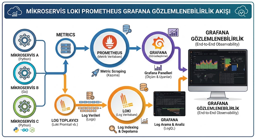
/metrics, Prometheus scrapes it every 15 seconds in our configuration (the default is 1 minute). Logs side: services write to stdout, an agent collects (Promtail in the picture; Alloy today, see below), Loki stores. Grafana shows both on one screen, on one time axis.# each service exposes an endpoint; Prometheus comes and reads it every 15 s
GET /metrics
# counter: cumulative total since the process started (the error ratio in an
# incident window is read with rate(), not from this number)
http_requests_total{service="payment",route="/pay",status="200"} 48213
http_requests_total{service="payment",route="/pay",status="500"} 512
# histogram: cumulative buckets + sum + count
http_request_duration_seconds_bucket{service="payment",le="0.1"} 39880
http_request_duration_seconds_bucket{service="payment",le="0.3"} 47102
http_request_duration_seconds_bucket{service="payment",le="1"} 48180
http_request_duration_seconds_bucket{service="payment",le="2.5"} 48590 # upper buckets matter: if the largest
http_request_duration_seconds_bucket{service="payment",le="5"} 48700 # finite bucket were 1 s, a p95 of 1.8 s
http_request_duration_seconds_bucket{service="payment",le="10"} 48722 # could never be shown (it would cap at 1 s)
http_request_duration_seconds_bucket{service="payment",le="+Inf"} 48725 # required: quantiles do not work without it
http_request_duration_seconds_sum{service="payment"} 6417.2
http_request_duration_seconds_count{service="payment"} 48725
The service sends nothing anywhere; it keeps counters in memory and Prometheus comes
to read them. So if Prometheus goes down the service is unaffected, and if the service
goes down Prometheus already sees it as up == 0 — the cheapest health
check there is. The route label above is a templated path
(/orders/:id); written as the raw path (/orders/4711) it is no
different from a user ID — more on that shortly.
# the service writes one JSON line to stdout and does nothing else
{"ts":"2026-09-07T09:05:14.310+03:00","level":"error","service":"payment",
 "correlation_id":"c-7f3a","event_id":"E2","msg":"psp timeout","duration_ms":3012}

# the agent reads the container's stdout and ships it to Loki
# Loki indexes only the LABELS: service, level, env
# line content is not indexed -> cheap, but a query must start with a labelPromtail has been end-of-life since 2 March 2026: support ended, no more updates. Development continues in Grafana Alloy — a single OTLP-compatible agent that collects logs, metrics and traces in one process and works with existing Prometheus and Loki backends as they are. Migrating an existing setup is one command:
alloy convert --source-format=promtail --output=config.alloy promtail.yamlWherever the rest of this post says "the agent", it was Promtail for us; it is Alloy today. The architecture does not change, the agent does.
The "indexes only the labels" line is why Loki is cheap: where Elasticsearch indexes
every word, Loki indexes a handful of labels and stores the line itself compressed. For
40 GB of logs a day the Elasticsearch cluster was three servers; Loki was one server plus
object storage. The price is in the same place: a query has to start with a
label ({service="payment"}) and filter content afterwards. "Every
line anywhere that mentions 4711" is expensive in Loki; "the payment service's last 10
minutes, mentioning 4711" is cheap.
Metrics: four golden signals, the rest is noise
Our first dashboard had 41 graphs: CPU, memory, GC time, thread counts, disk, network, JVM pools. Nobody looked at it, because none of them answered "what is the user experiencing right now". The second dashboard kept four graphs per service. The PromQL below can be copied as is; we had written two of them wrong at first, and the reason is underneath.
| Signal | PromQL | What it tells you |
|---|---|---|
| Traffic | sum(rate(http_requests_total{service="payment"}[5m])) | If requests dropped, something in front is broken |
| Errors | sum(rate(http_requests_total{service="payment",status=~"5.."}[5m])) | A ratio; not a count |
| Latency | histogram_quantile(0.95, | p95; not the average |
| Saturation | connection pool, queue depth, consumer lag | How far from full |
# error rate - BROKEN: the status label exists on both sides,
# Prometheus matches labels, so 500 is divided only by 500 -> always 1
rate(http_requests_total{status=~"5.."}[5m]) / rate(http_requests_total[5m])

# p95 - INCOMPLETE: without sum by (le) you get one p95 per pod;
# not the service's p95 but N pod p95s, and the alert fires per pod
histogram_quantile(0.95, rate(http_request_duration_seconds_bucket[5m]))
For a per-service breakdown use sum by (service, le). We had written both
queries in a single-pod test environment, where both of them "worked".
Three more traps, and we fell into all three:
The shipping service's average latency was 120 ms and the dashboard was green. The p95 was 1.4 seconds: one customer in twenty was waiting at least 1.4 seconds, and the average could not see it. A latency graph always plots a percentile. Then there is fan-out: if one user request passes through six services, each service's p95 can be green while the end-to-end experience is not "one in twenty" but one in twenty six times over; per-service p95 flatters what the user actually sees.
Percentiles have limits too: histogram_quantile interpolates linearly
between bucket boundaries, so the accuracy of the p95 depends on the bucket layout (if
it says 1.8 between le="1" and le="2.5", that is an estimate; had the
largest finite bucket been 1, you could never have seen 1.8 at all).
And percentiles do not aggregate: the average of two services' p95s is
not a meaningful number; you sum the raw buckets and take the quantile last. Native
histograms (Prometheus 2.40+) largely solve both bucket cardinality and interpolation
error; for a new setup they are the first choice.
# a developer added this to find out "which customer is slow":
http_request_duration_seconds{service="payment", user_id="184203", ...}

# every distinct user_id = a separate time series
# 2.4 million series -> Prometheus OOM -> every metric blind for 40 minutes
Labels exist for small, countable sets: service name, templated route, status code, environment. User, order, request ID, raw URL — none of these is a label. "Which customer is slow" is a question for logs, not metrics; once you drop into the logs by correlation ID it is already answered.
The real lesson of that day: "developers shouldn't add it" is not a guardrail. To make sure it never happened again we put limits on Prometheus:
# prometheus.yml - on the scrape job
sample_limit: 20000      # a target returning more series than this is rejected
label_limit: 30          # at most 30 labels per metric
target_limit: 500

metric_relabel_configs:  # drop dangerous labels before ingestion
  - regex: "user_id|order_id|request_id"
    action: labeldrop

# look once a week: the busiest labels and metrics
curl -s localhost:9090/api/v1/status/tsdb | jq .data.seriesCountByMetricName
The Loki equivalent is per-tenant stream limits (max_streams_per_user,
per_stream_rate_limit). When a limit is exceeded that service is rejected;
the dashboard does not go blind. The offending service gets a red alert — a good
trade against 40 minutes of blindness.
Logs: structure, not lines
The log lines inherited from the monolith looked like this:
2026-09-07 09:05:14 ERROR PaymentClient - timeout after 3012ms for order 4711 (retry 2)Readable, but not queryable: for "payment calls that took over 3 seconds" you write a regular expression, and the week someone rewords the message it silently returns nothing.
{"ts":"2026-09-07T09:05:14.310+03:00","level":"error","service":"payment",
 "correlation_id":"c-7f3a","event_id":"E2","order_id":4711,
 "msg":"psp timeout","duration_ms":3012,"retry":2}

# LogQL: start with a label, trim with a line filter, then filter on fields
{service="payment"} |= "psp timeout" | json | duration_ms > 3000
{service=~"payment|shipping"} |= "c-7f3a" | json | correlation_id = "c-7f3a"
The |= in the middle is the real performance lever: it runs on compressed
lines and cuts most of the data before it reaches | json.
| json parses every line; without a line filter it is genuinely slow. The
second query is the whole story: one customer's request across six services, in time
order, in one query.
Four fields are mandatory on every line and the service skeleton sets them
automatically: service, level, correlation_id,
event_id. The developer writes only msg and their own fields.
A line without those four is a line that does not exist. event_id is the identity
of the domain event that caused the line to be written (OrderCreated = E1, say;
one of the three IDs from the migration post):
"which event was being processed when this line was written" is answered in one query.
We made the same mistake on the log side: we made correlation_id a Loki
label, "so we can search fast". Every request created its own stream, the Loki
index swelled, queries took minutes. Same rule: labels are for countable sets;
identifiers live inside the line.
Loki 3.x has a middle ground for exactly this: structured metadata.
High-cardinality fields such as correlation_id can be stored and filtered
without becoming a stream label and without paying the | json cost
({service="payment"} | correlation_id = "c-7f3a"). It is the current form of
the "identifiers inside the line" rule; with Alloy as the agent it is populated over
OTLP automatically.
The "full context on error lines" rule is dangerous in a payment service: logging the
input of a payment call as it is means logging card numbers, names and addresses
— a GDPR and PCI DSS incident, for as long as the retention period. The rule:
inputs masked (4111********1111), personal fields never
written; the logging library does the masking, not the developer. We learned this item
in a breach drill, not an audit.
One screen, one time axis
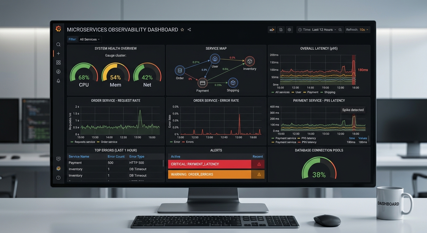
The layout is a reading order: what the user feels at the top (latency, errors), candidate causes in the middle (request rate, connection pool, consumer lag), evidence at the bottom (recent errors, active alerts). When the on-call engineer opens the dashboard in the morning their eye runs top to bottom, and by the third row the cause is usually obvious.
The real trick is not the graphs; it is the shared time axis. You select 09:05 on the latency graph; the log panel jumps to the same range; the service map shows who returned errors to whom in that minute, in red. Doing that by hand across three tools — copy the timestamp, switch tabs, paste, correct for the timezone — was half of the three hours.
- Top right: p95 from 80 ms to 1.8 s. Onset 09:05:10.
- Panel below: error rate from 0.1% to 4%, same second. So it is not just slow; it is failing.
- Service map: the payment → psp edge is red. The problem is not ours; it is the payment provider.
- Click the graph → Loki:
{service="payment"} |= "psp timeout" | json | duration_ms > 3000— 117 lines in the incident window. - Decision: open the circuit breaker, show customers "we can't take this right now", call the provider. Time: 6 minutes.
The bridge from metrics to traces lives on the same
screen: exemplars. When a histogram bucket is written, the
trace_id of that sample is stored with it; click a point on the latency
graph and Grafana takes you straight to that request's trace. The answer to "why is p95
1.8 s" is one click away: inside which service, in which call. Once Alloy delivers over
OTLP the natural form of this is OpenTelemetry: trace_id and span_id
land in the log line on their own, correlation_id gives way to them, and log
→ trace becomes one click too.
And the dashboard itself: its JSON and the alert rules live in git and are loaded by provisioning. A hand-edited dashboard turns into something nobody understands within a week; for the one in git it is clear who changed what, when and why.
Alerting: on what the user feels, not on causes
Back to that Monday morning. The CPU alert at 09:12 was correct — CPU really was at 68% — and completely useless. Users do not feel CPU; they feel latency and errors. Worse, that alert fired every Monday morning as traffic rose; the team had long since learned not to read it. An alert that fires constantly is the same as one that is muted.
| Cause-based alert (old) | Symptom-based alert (new) | |
|---|---|---|
| What it measures | CPU, memory, disk, GC | p95 latency, error rate, consumer lag, is the service up |
| When it fires | Threshold crossed, instantly | Above the symptom threshold for 5 minutes |
| Night pages per month | 11 | 4 |
| Pages that were real problems | 2 / 11 | 4 / 4 |
| Where CPU went | an alert | a graph on the dashboard; consulted when hunting for a cause |
# symptom threshold: p95 across the service (sum by le), firing if it lasts 5 minutes
- alert: PaymentLatency
  expr: histogram_quantile(0.95,
          sum by (le) (rate(http_request_duration_seconds_bucket{service="payment"}[5m]))) > 0.3
  for: 5m
  labels:  { severity: critical }
  annotations:
    summary: "payment p95 above 300 ms for 5 minutes"
    runbook: "https://wiki/runbook/payment-latency"   # the first three steps live here

# an alert built on rate() returns EMPTY when traffic drops to zero, and stays silent.
# these fire when the service is down entirely:
- alert: PaymentDown
  expr: up{job="payment"} == 0
  for: 2m
- alert: PaymentNoMetrics
  expr: absent(rate(http_requests_total{service="payment"}[5m]))
  for: 5m
- alert: PaymentTrafficDropped
  expr: sum(rate(http_requests_total{service="payment"}[5m]))
        < 0.3 * sum(rate(http_requests_total{service="payment"}[5m] offset 1w))
  for: 10m

# dead man's switch: ALWAYS fires. Alertmanager has a "tell me if this goes quiet" rule;
# if it goes quiet, Prometheus or the alerting chain itself is dead.
- alert: Watchdog
  expr: vector(1)
  labels: { severity: none }
for: 5m alone removed half the alerts: an alert that fires on a single
spike is noise, a spike that lasts five minutes is an incident. Without the three rules
at the bottom, "the service died" is the quietest incident of all — the p95 alert
finds no data to compute and says nothing. Watchdog answers the same class of problem: in
the incident where we were blind for 40 minutes, nothing told us; now there is an
alert that always fires, and the moment it stops an external channel calls. The runbook line looks small; it
means the person woken at 3am does not have to remember the first three steps.
An honesty note: the "symptom threshold" in the table is not an SLO alert; it is a better-chosen threshold. A real SLO alert is built on the error budget's burn rate: "fire if the budget is burning 14× too fast over the last hour and also over the last 5 minutes" — multiple windows, multiple rates. A static threshold knows how to stay quiet for a three-minute spike at 3am but never sees a 1% degradation that lasts all day; burn rate classifies both correctly. We moved there in month six; the numbers in this post belong to the symptom-threshold period.
Half of the drop from 11 to 4 came from the rules; the other half from how the alert reached a person. Four things in Alertmanager:
- Grouping: error alerts from six services in the same minute are one notification, not twelve phone calls.
- Inhibition: if
up == 0is firing, the same service's p95 and error alerts are suppressed — the cause is known, the symptom need not be repeated. - Silences: during planned maintenance an alert is silenced for an hour, with a reason; not with a "maintenance, ignore" message in the chat.
- Watchdog: the always-firing alert goes to an external service; if it does not arrive for 5 minutes, that service rings a phone — the alerting chain's own alert.
- On-call rotation: critical calls the on-call engineer's phone, warning goes to the morning channel. No warning arrives at 3am.
The costs nobody budgeted: volume, retention, single point
Structured logs are good; logging everything is not. In month three daily log volume
reached 40 GB, and half of it was one service writing every request twice
at debug level. Three rules:
infoand above in production.debugis switched on only during an incident, for one service, for one hour — and a timer switches it back off.- The happy path is one line. A request finishing successfully is one line; no step-by-step narration. Steps are metrics.
- Error lines are full (masked), success lines are short. An error line carries the context: the input masked, duration, retry count; a success line carries only IDs and duration.
Volume fell from 40 GB to 9 GB and search got faster; in Loki, query time is proportional to the data scanned.
The natural continuation of volume is retention. Prometheus's local
retention defaults to 15 days; for "what happened last quarter" you need
remote_write to Mimir or Thanos — we keep 13 months in Mimir. On the
Loki side the real bill is object storage; without retention_period and the
compactor, even 9 GB a day is 3 TB in a year. We keep 30 days hot, one year on a cheap
tier, then delete.
And the single point: the Prometheus that went blind for 40 minutes with an OOM was a single instance. There are now two Prometheus instances in parallel scraping the same targets, both writing to Mimir; Grafana reads from Mimir. When one goes down, neither the data nor the dashboard disappears. It is one paragraph, but it is the reason the 40-minute blindness never happened again.
From the field: from 3 hours to 25 minutes
| Before (6 tabs + grep) | After (one screen) | |
|---|---|---|
| Finding the faulty service | 40–90 min | 2–5 min |
| Reaching the root cause (average) | 3 h | 25 min |
| Seeing one customer's request end to end | matching timestamps by hand | one LogQL query |
| Night pages / month | 11 | 4 |
| Real problems / pages | 2 / 11 | 4 / 4 |
| Daily log volume | 40 GB | 9 GB |
| Time the metrics dashboard was blind | 40 min (cardinality) | 0 (limits + 2 instances) |
| Metric retention | 15 days | 13 months (Mimir) |
| Who looks at the dashboard | the on-call engineer, sometimes | the whole team, every morning at standup |
The last row is the least technical and the most useful. The dashboard is on the screen for the first minute of standup: what happened last night, which service is near its limit. Once the dashboard became something everyone looked at, the graphs evolved to match what people looked for; the 41-graph dashboard nobody looked at never evolved at all.
Checklist
- Is there a
/metricsendpoint, and is it in Prometheus's target list? Does the histogram emit+Inf,_sumand_count? - Are the four signals on the dashboard: traffic, error rate, p95 latency, saturation?
- Is error rate computed with
sum()and p95 withsum by (le)? (In a single-pod environment both look right while wrong.) - Is the latency graph a percentile, or an average? Is the largest finite bucket above the worst value you want to see?
- Is the
routelabel templated (/orders/:id)? Do any labels carry identifiers? - Are
sample_limit,label_limitandmetric_relabel_configsset? Loki stream limits? - Are logs single-line JSON? Are
service,level,correlation_id,event_idon every line? - Are Loki labels only service, level and environment? Are identifiers inside the line or in structured metadata?
- Do LogQL queries trim with a
|=line filter, or go straight to| json? - Are inputs masked? Does personal or card data never reach the logs?
- Is the production log level
info? Is there a timer that switchesdebugback off? - Do alerts sit on symptoms (p95, error rate) or on causes (CPU)?
- Are there
up == 0,absent(), traffic-drop and Watchdog rules? - Does every alert have a
forduration and a runbook link? Are grouping and inhibition configured in Alertmanager? - Is it one click from a metric to its logs — with the same time range? Are exemplars enabled?
- Has retention been decided: Prometheus
remote_write, Lokiretention_period? - Is Prometheus a single instance?
- Is the log agent Alloy, or still Promtail?
- Are dashboards and alert rules in git, or edited by hand?
- Has anyone other than the on-call engineer opened the dashboard in the last week?
Conclusion
Observability is not buying tools; it is building an arrangement where metrics say where to look, logs say what you are seeing, and the two sit side by side at the same second. Prometheus, Loki and Grafana make that cheap; but with the same three you can also build a 41-graph dashboard nobody looks at — we did. You can also build a dashboard that shows green on wrong PromQL — we did that too.
The sequence to remember: four signals first, with correct PromQL; then structured logs; then put both on one time axis; tie alerts to what the user feels, and make them fire when the service dies too; never use a label for an identifier, and put a guardrail behind that rule. The rest — the service map, the pretty gauges, the coloured panels — comes on its own once that arrangement exists, and is useless until it does.